Designing a Sensitive Campaign That Speaks to Every Patient
1 year ago | Kate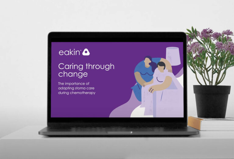
When you’re talking to people undergoing chemotherapy, while also managing a stoma, words alone aren’t enough.
That’s why, for our Eakin chemotherapy campaign, the visual lead was the hero. Not just any image, but a hug. Rendered in a Picasso-inspired style, our hero illustration was abstract enough to not alienate — and full of meaning. Because sometimes a hug can say what words can’t.
Visual First. Human Always.
The moment someone saw the campaign — whether in clinic, through print, or online — we wanted them to feel something before they read a single sentence. The warm, expressive hug at the heart of the design was a universal symbol of care, support, and reassurance. It acknowledged the weight of what someone might be going through without explicitly stating it. That image was our way of saying, ‘You’re not alone in this.’
Its abstract style was deliberate. The Picasso-like linework enabled the figures to represent anyone, regardless of gender, background, or age, without resorting to stereotyping or exclusion. It offered empathy without invading privacy. In design terms, it was quiet, powerful, and immediate.
From Emotion to Action
The campaign supported patients who may need to adapt their stoma care during chemotherapy, a difficult, emotional time when confidence can be shaken. Everything, from the typography to the tone of voice, was designed to calm and guide, rather than overwhelm. But that first image — that hug — set the emotional tone.
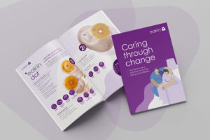
Once engaged by the visual, patients could explore information structured in a clear, calm layout. Illustrations explained care steps discreetly, while inclusive colours and skin tones reflected the diversity of real people. We worked hard to ensure nobody felt “othered” — whether they were male or female, 30 or 70, living independently or with help.
Print with Purpose
Translating sensitivity into print means designing for real-life touchpoints. This wasn’t a brochure to sit on a desk — it was something people might reach for during a moment of uncertainty. So we kept the design open and breathable, the language reassuring, and the visuals warm. See the full campaign here
We considered everything from font size (for older eyes) to skin tone accuracy (for inclusivity) to space (to avoid clutter and allow room for emotion). We wanted it to feel less like a leaflet and more like a helping hand.
A Collaborative Embrace
Campaigns like this don’t come from behind a screen. They come from conversations with patients, with nurses, with our client partners. Together with Eakin, we created something that felt not only informative but also compassionate. The hug became a recurring theme — a reminder that even in the most medical of moments, human connection still matters most.
Final Thought: The Power of One Image
Visuals speak. And when chosen with care, they speak volumes. The Picasso-style hug in this campaign didn’t just support the message — it was the message. It reminded us that at the heart of every good healthcare campaign is a person, needing to be seen, heard, and sometimes, held.